
Deerwalk's latest release incorporates machine learning to identify members with potentially undiagnosed diabetes and features new chart visualization tools

This month’s release of Deerwalk Plan Analytics, the flagship population health analytics and reporting application, incorporates new features in version 9.4. Below are the key highlights:
- Machine Learning - Predictive Diabetes Scoring
- New Visualizations - Create Dashboards
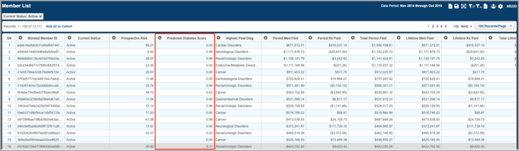
Those who attended our first user group conference, Deerwalk Ascend 2019, got the chance to hear our product team share details on a series of initiatives that will incorporate machine learning and artificial intelligence. We are excited to announce Deerwalk's first feature that utilizes machine learning, Predictive Diabetes Scoring.
This score helps to address the dangers associated with undiagnosed diabetes, which include a significantly increased risk of cardiovascular disease along with nerve and organ damage. Accessible from within the Member Search tool of Plan Analytics, the new Predictive Diabetes Score can indicate the likelihood a member has diabetes. To further aid in the identification of undiagnosed members, current clients can opt to use this score in conjunction with existing diabetic flags they've already set up in Plan Analytics.
The model utilizes data from four million members in our database to assign each member a score on a scale of zero to one. A score of "one" represents the maximum likelihood that a member has diabetes and a score of "zero" represents the minimum likelihood that a member has diabetes.
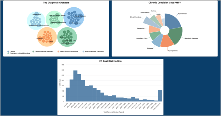
2. New Visualizations in Create Dashboards
Create Dashboards allow you to build custom dashboards using using charts and visual KPI tiles to allow for complete flexibility in your reporting and what you choose to present to clients, stakeholders, or decision-makers. As a new addition to Create Dashboards, three new visualization types have been made available for chart creation:
- Packed bubble chart in the Top Diagnosis Groupers Chart
- Variable radius pie chart in the Chronic Condition Cost PMPY Chart
- Histogram chart in the ER Cost Distribution Chart
Schedule a demo to learn more about how to use Deerwalk Plan Analytics and the latest features.

Subscribe to our blog or follow us on Facebook, Twitter or LinkedIn to join the conversation.